Visual structure tree
Build the page from semantic elements such as header, nav, main, aside, section, article and footer, nested like a real document.
CSS Grid & Flexbox layout builder · an Atelier studio
Build responsive page layouts that adapt without media queries.
IntrinsicFlow builds page structure visually. Arrange semantic regions, give each one an intrinsic behaviour such as an auto-fit grid or a sidebar switcher, pin headers and sidebars, and export clean HTML and CSS.
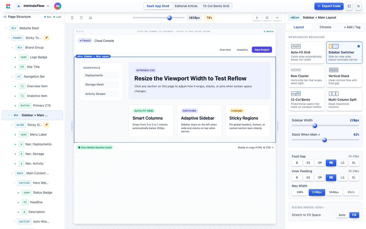
Build the page from semantic elements such as header, nav, main, aside, section, article and footer, nested like a real document.
Auto-fit grids, sidebar switchers, row clusters, stacks, 12-column bento grids and multi-column splits that adapt on their own.
Pin headers, sidebars and footers with offsets, layering and backdrop blur, then scroll inside the preview to test them.
Gaps, padding and type sizes use clamp()-based fluid scales that grow smoothly with the viewport.
Drag the preview from phone to wide desktop and watch every region reflow in real time.
Export clean semantic HTML with matching CSS, or a single self-contained HTML file.
Start from an app shell, article or bento grid.
Add, nest and name semantic regions.
Set grids, switchers, gaps and sticky chrome.
Copy semantic HTML and CSS, or one file.
IntrinsicFlow favours intrinsic CSS, such as flex-basis switchers, auto-fit grids and fluid clamp() spacing, so most layouts need zero media queries.
.app-shell {
  display: flex;
  flex-wrap: wrap;
  gap: clamp(1rem, 0.8rem + 1vw, 1.75rem);
}

.app-shell > .sidebar {
  flex-basis: 220px;
  flex-grow: 1;
  position: sticky;
  top: 0;
}

.app-shell > .main {
  flex-basis: 0;
  flex-grow: 999;
  min-inline-size: 62%;
}It opens instantly in your browser. Nothing to install, nothing to sign up for.